- Wandering Down the Rabbit Hole of History
- Posts
- Chicago's Municipal Device
Chicago's Municipal Device
A survivor of the 1893 Columbian Exposition
Patricia L. Morse
January 22, 2024
January Herald Article
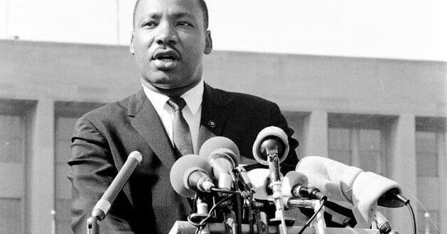
My latest article for the Herald just posted. It’s a report about Dr. Martin Luther King, Jr., and the fact Hyde Park played a role in his life, small but noticeable. He even held rallies over the local high school controversy in the neighborhood.
Chicago’s Municipal Device
A scavenger hunt I like to play as I walk around the city is spotting examples of the Chicago Municipal Device. The “Y” represents the heart of Chicago--Wolf Point--where the south branch and the north branch join and flow into Lake Michigan. It’s surrounded by a circle to show that the city is united.

A modern lightpole stylized to look old that’s on the 11th Street Bridge in Grant Park. (Photographer PLM)
Once you know about it, you see the “Y” everywhere, especially on older buildings, such as this unused fire station at Dorchester and 62nd Place.

The Y inside a shield at the top of old brickwork (Photo: PLM)
It’s even in the center of the iconic Chicago Theater neon sign.

This blog (link below) has some lovely examples in public art, including the Tiffany dome in the Chicago Cultural Center, once the public library.

The symbol dates from 1892 as the city prepared for the grand dedication of the Columbian Exposition on Columbus Day. It was all about boosterism. The city planned to put up decorations everywhere, and they wanted a unified theme—both a color scheme and a symbol. They wanted the effect to be “harmonious,” not the “harlequin” mishmash of symbols and colors that “other” cities might use.
They also wanted Chicagoans to be proud. The organizers said they should be proud the way a Harvard student was proud to wear crimson. They realized that a way to boost that kind of love of the city in the citizens (and get everyone willing to come spend money at the fair) was to run a contest, so the Chicago Tribune offered a $100 award.
Some of the opinions expressed on what color should represent Chicago were interesting. One person interviewed in the Trib thought yellow would symbolize the grain shipping through the city, a huge part of the city’s wealth. Yellow could also stand for the goldenrod that was still growing all over in the many undeveloped lots. A businessman pointed out that yellow might remind everyone of cholera (which was a recurring problem in the city) and that red flags should be illegal because they were associated with Communism and labor unrest. It, after all, was just six years since the Haymarket riot.
The Tribune got 829 entries. The winner was Alfred Jensen Roewad, who suggested an upside down “Y”—white on a background of “terracotta,” not officially red. The terracotta stood for the clay that was so important in rebuilding Chicago in brick and white stood for the silvery waters of the river. Roewad said that the colors went well against the blue of the sky and the green of trees as it hung on stands and lightpoles. He also said that it wasn’t an image of the river. It was an image of the three sides of the city—North, West, and South—coming together. We still have that problem, even when it comes to baseball teams.
Alfred J. Roewad was an interesting case. He told the Tribune that he had come to Chicago just two years before from Denmark at the age of 42—because the Fair would be here and that meant Chicago was on the cutting edge of engineering. He wanted to work in steel and got his wish, first with a bridge-building company, then at the fair working on the design for the monstrous steel trusses of the Manufactures and Liberal Arts Building.
Francis Davis Millet, the painter and director of decorations for the fair, was the chairman of the judges. He liked the colors because he said the red and white of the banners against the deep blue of the October sky would make the national colors. He also thought they looked cheerful against Chicago’s buildings, which were darkened by thick coal soot.

Time was exceedingly short to cover the city by the dedication ceremony, so decorating the city became a DIY project. The committee told citizens to make their own banners and somehow make the phoenix to top their poles. The Tribune provided detailed instructions and diagrams for the banners.

The runner up also chose red and white but his design was a red phoenix rising from a nest of flames against a white background. Now where have I seen that…

Seal of the University of Chicago
In 1917, the City Council unanimously voted to make Roewad's symbol the official Municipal Device for the City of Chicago, one of the only times, the Tribune later noted, that Hyde Park’s reform alderman voted with Bathhouse John Coughlin and Hinky Dink Mike Kenna. As far as I can tell, we seem to be the only city with a Municipal Device. The ordinance said it should be on everything the city owns. They decided, however, that it had to be reversed because the city had reversed the flow of the Chicago River in 1900, so it became a Y.
At some point in the 20th Century it fell out of favor—perhaps because the Chicago River was itself filthy and ignored, lined with decaying warehouses. One suggestion is it looked too much like the Mercedes Benz logo or the peace sign. The city actually preferred putting the seal on things. It was defined by an ordinance in 1837. It celebrates the harbor in the Chicago River with a big schooner, and the displacement of the original inhabitants (though of course this is a Plains Indian from central casting and not at all the people who were here already). The grain in the center is apparently celebrating the fortunes in shipping about to come their way. And of course, because why not, there’s a baby sleeping in the half shell floating in the sky. No one seems to have any idea what that is.

It seems like it’s time for a redesign contest.
Cook County recently ran one for its flag and got terrific entries. Maybe the restoration of the river water and the transformation of its banks into the Riverwalk of restaurants and tourist boats has had an impact. We are once more celebrating the Y of the Chicago River, more accurately pointing west to east now.

According to the high school student who designed it, the stars are red to represent social change, with seven points to represent the regions of the county, along with the city of Chicago itself, and the forest preserve. The blue “Y” represents the Chicago’s River’s split at Wolf Point, while the green outline is a nod to the county’s waterways, land, and riverbanks. The blank slate/white background represents future innovation that’s to come.
Back in 1892, the rival newspaper, the Inter-Ocean, also ran a contest for a symbol of Chicago. Their winner was Miss I Will, who I wrote about in November.

If you don’t remember what the heck is on her head, it’s a phoenix in a nest of flames, not a chicken in a basket.
Join the conversation